How do you make it compatible with smartphones?
In fact, Google also officially announced a statement in June recommending responsive web design.
Google's recommendations for building a smartphone-optimized website
Sites that use responsive web design, i.e. serve the same HTML to all devices at a single URL and use CSS to change the design for each device.This is the setup recommended by Google.
- A site that uses a single URL for all devices and dynamically serves different HTML and CSS depending on the user agent, such as desktop or mobile.
- Sites that have separate mobile and desktop sites.
We will also introduce you to a website that provides a concise explanation of the above content.
In this context, we recently published an English article that goes into more detail about responsive web design, so we'd like to introduce it to you with a brief translation.
Mobile Websites vs Responsive Design: What's the right solution for your business?
Mobile Friendly Website
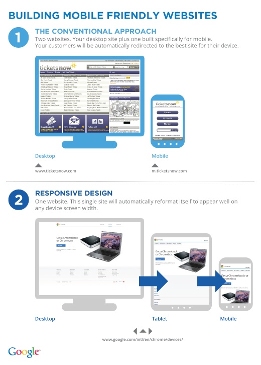
1. The Conventional Approach
It's good that they say so. They redirect and show another source.
2. Responsive Web Design
Automatically adjusts to the device screen size.
Which solution is better for your mobile site?
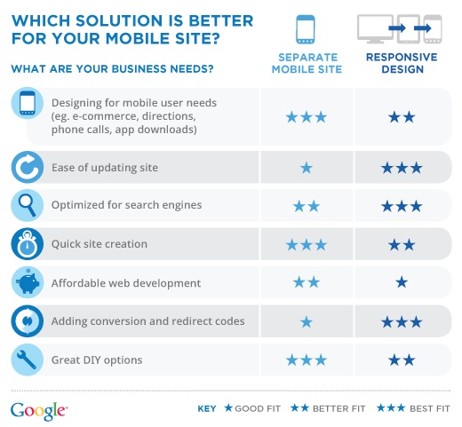
And, "Which solution is better for your mobile site?"
The article compares traditional methods with responsive web design.
The more ★'s, the better.
| Mobile site | Responsive Design | |
|---|---|---|
| Designed to meet the needs of mobile users | ★★★ | ★★ |
| Ease of updating the site | ★ | ★★★ |
| Search Engine Optimization | ★★ | ★★★ |
| Site creation time | ★★★ | ★★ |
| Easy website development | ★★ | ★ |
| Adding conversion and redirection codes | ★ | ★★★ |
| Ease of adding options | ★★★ | ★★ |
 English
  Japanese